))
Designing Navigator’s 20th Anniversary
Fetch error
Hmmm there seems to be a problem fetching this series right now.
Last successful fetch was on February 27, 2024 04:03 (
What now? This series will be checked again in the next day. If you believe it should be working, please verify the publisher's feed link below is valid and includes actual episode links. You can contact support to request the feed be immediately fetched.
Manage episode 269305313 series 1348434
Content provided by Navigator | When You Can't Afford to Lose®. All podcast content including episodes, graphics, and podcast descriptions are uploaded and provided directly by Navigator | When You Can't Afford to Lose® or their podcast platform partner. If you believe someone is using your copyrighted work without your permission, you can follow the process outlined here https://ppacc.player.fm/legal.
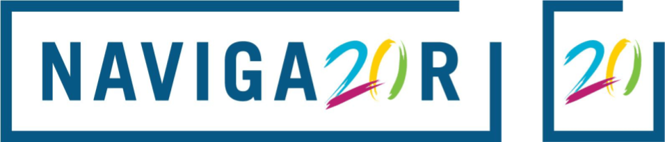
To celebrate Navigator’s 20th anniversary our in-house creative and digital agency, true, took up the challenge of developing a 20th anniversary logo and refreshed website.
Evolution of a logo
Navigator’s 20th anniversary logo celebrates this milestone achievement , incorporating four secondary colours in the form of brush marks of matching stroke width. The colour and dynamic design speaks to creativity, agility, and a feeling of celebration.
Navigator’s logo was built with a bold and specific stroke weight which allows it to stand out at small sizes. We matched this weight with the brush strokes and placed the ‘20’ mark within the boundaries of the open Navigator frame to stay true to the logo’s original structure and timeless design.
Shaping the narrative
The fundamental shape of Navigator’s logo is a rectangle with a gap in its frame representing the fact there is always a way forward. To chart a strategy in an increasingly complex world, Navigator’s team relies on a broad range of expertise and diversity of opinions. Shaping a narrative is never a linear process, even if the final result seems clear in hindsight.
To represent this complexity, true evolved the rectangular base shape into a series of trapezoid frames demonstrating the diverse perspectives and integrated service offerings critical to shape the public narrative in high-stakes public affairs campaigns.
20/20 vision
The final application introduced secondary colours to tie in the design direction of Navigator’s 20th anniversary logo. The result is a bold use of colour and shapes that work with the existing Navigator brand and strengthen it. The colour and unique shapes deliver a cutting edge and dynamic look and serve as a strong visual differentiator within the marketplace.
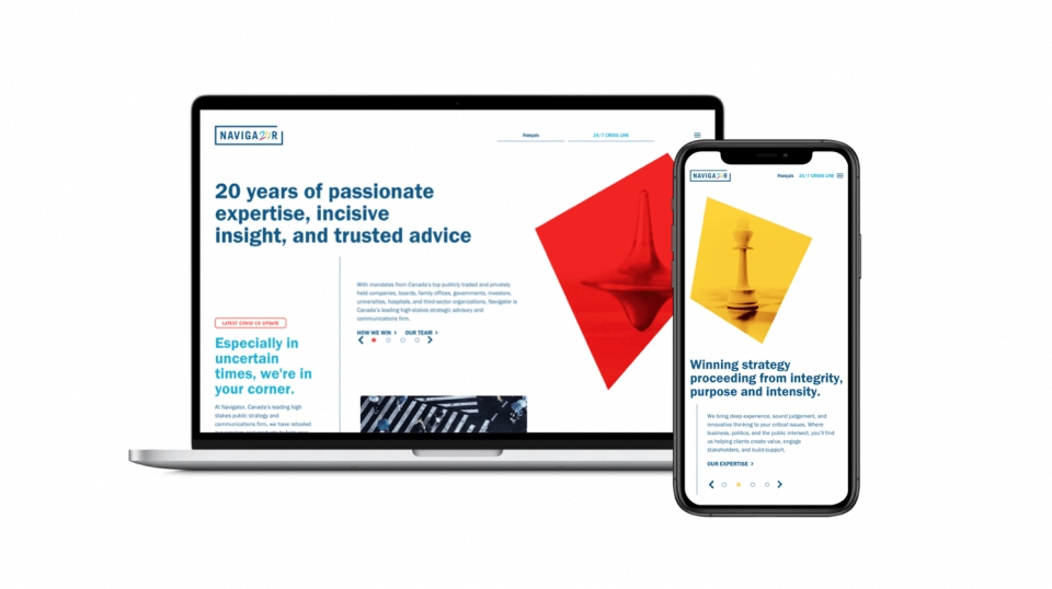
Navigator is proud of its 20 year history serving clients and stands at the forefront of public affairs strategy with unparalleled ability to react in high-stakes situations, shaping and defining public affairs narratives for its clients. As we embark on our next chapter together, may we achieve lasting significance with the clarity, foresight and confidence that only 20/20 vision can bring.
![]()
A creative and digital agency seamlessly integrated with Navigator. We mobilize communities to take action by crafting compelling narratives, captivating visuals, and meticulously-targeted campaigns. The experiences and solutions we design engage, shift opinion, and lead people to take action. Contact us.
4 episodes